
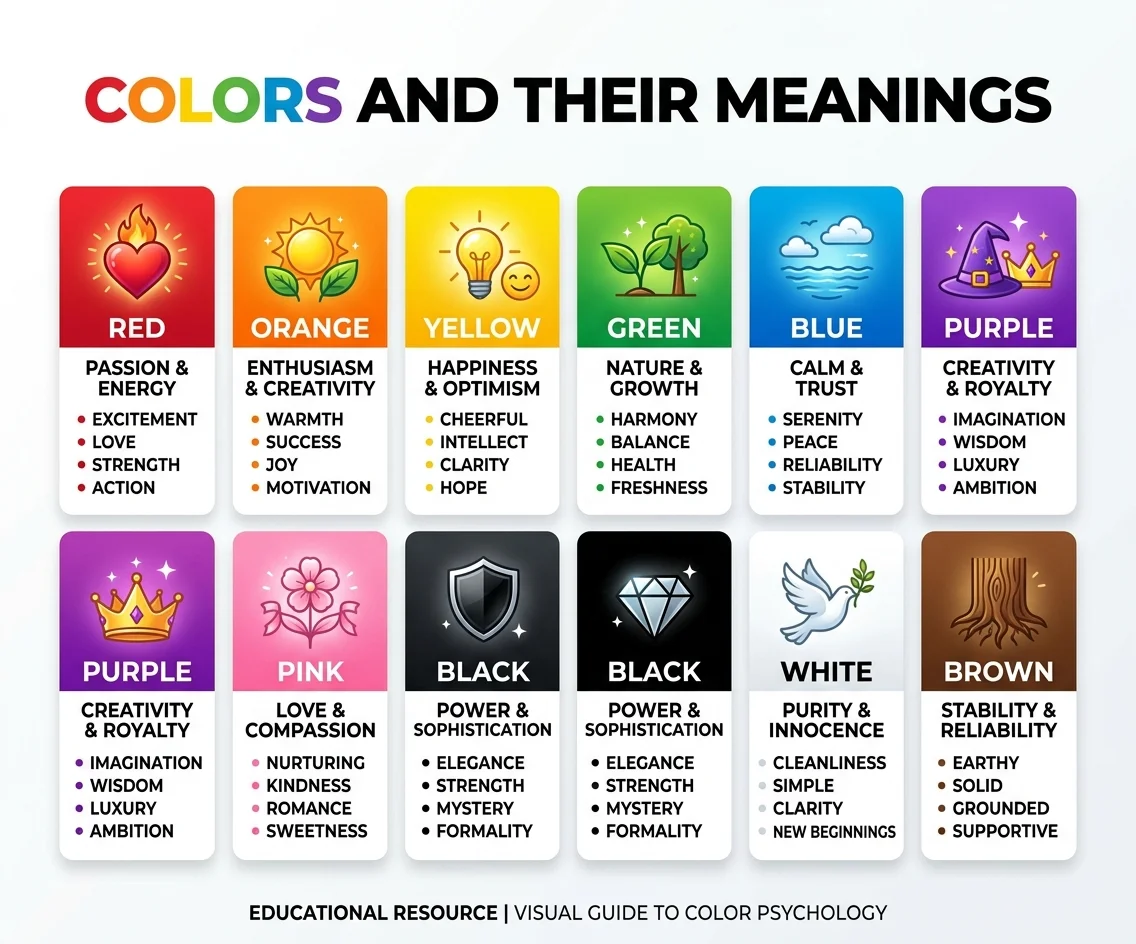
A sunset can feel peaceful, a red warning sign can demand attention, and a green garden can feel refreshing. Color quietly shapes perception, emotion, memory, communication, and everyday visual experiences.
Understanding colors and their meanings can make choices in art, fashion, interiors, branding, and design more intentional. Although associations vary across cultures and situations, color remains a powerful visual language.
What Does Color Psychology Mean?
Color psychology explores how people perceive colors and how those perceptions can connect with emotions, associations, attention, and behavior. It sits at the intersection of psychology, visual communication, art, design, marketing, and everyday experience.
At its simplest, colors and their meanings describe the ideas, emotions, and qualities people commonly connect with particular hues. Red may suggest energy or danger, while blue can suggest calmness or trust, depending on context.
Color psychology does not mean that every person will react to a color in exactly the same way. Individual experiences, culture, surroundings, saturation, brightness, and the object displaying the color can all influence perception.
This is why a color chart should be treated as a helpful starting point rather than a strict psychological rule. Research has found meaningful color-emotion associations, but those associations can vary between people and situations.
Several basic color concepts are especially useful:
- Hue: The basic color family, such as red, blue, or green.
- Saturation: The intensity or vividness of a color.
- Lightness: How light or dark a color appears.
- Warm colors: Reds, oranges, and yellows are commonly described as warm.
- Cool colors: Blues and greens are commonly described as cool.
- Color palette: A selected group of colors used together.
Understanding these concepts helps explain why two versions of the same color can create completely different impressions.
For example, a soft pastel blue may feel gentle and airy, while a dark navy blue can appear formal and authoritative. The hue has not completely changed, but its lightness, saturation, surrounding colors, and purpose have.
When designers study colors and their meanings, they are therefore looking beyond simple color names. They consider how color works within a complete visual experience and how an audience may interpret that experience.
The Origins of Color Psychology
The relationship between color and symbolism is not new. Ancient civilizations used pigments and colored materials to communicate social position, religious ideas, celebration, mourning, wealth, and identity.
Purple provides a well-known historical example. Producing certain purple dyes was once difficult and expensive, helping the color become associated with wealth, authority, and royalty in several historical contexts.
The modern study of color psychology developed much later. During the nineteenth and twentieth centuries, psychologists, artists, and researchers became increasingly interested in the relationship between visual experiences, emotions, perception, and human behavior.
Artists also played an important role in exploring emotional responses to color. Figures such as Wassily Kandinsky wrote extensively about the expressive potential of colors and their relationships with artistic experience.
Carl Jung also discussed colors within broader psychological and symbolic ideas. However, historical theories should not automatically be treated as modern scientific evidence. Contemporary research uses experiments, surveys, cross-cultural comparisons, and systematic reviews to examine color associations.
The history of colors and their meanings also shows why symbolism can change over time. A color can acquire new associations as societies, technologies, fashions, traditions, and communication systems develop.
Cultural differences are particularly important. A color that represents celebration in one society may have a very different association elsewhere. Even within the same culture, age, profession, personal experience, and situation can influence interpretation.
Modern color psychology therefore combines several perspectives:
- Historical symbolism
- Psychological research
- Cultural studies
- Visual communication
- Design practice
- Marketing research
- Artistic expression
This broader approach is more useful than assuming that every color has one permanent definition.
Read More: Laundry Symbol Meanings: What Do They Mean?
Exploring the Psychological Influence of Color
Color can influence how people experience visual environments. It can attract attention, create contrast, organize information, communicate identity, and contribute to emotional impressions.
One reason colors and their meanings are so interesting is that color rarely works alone. The same hue can produce different impressions when its brightness, saturation, surrounding colors, or visual context changes.
Warm colors such as red, orange, and yellow are often connected with energy, warmth, excitement, or higher emotional intensity. Cool colors such as blue and green are frequently associated with calmness, nature, tranquility, or lower emotional intensity.
These associations are tendencies rather than guaranteed reactions. Research has found that color-emotion relationships are influenced by cultural background, personal experiences, and specific visual contexts.
For example, red can attract attention and communicate urgency in a warning sign. The same color can communicate romance on a greeting card or excitement in entertainment branding.
The surrounding environment also matters. A small red element against a mostly neutral background may become a strong focal point. A large red wall may create an entirely different visual experience.
Designers can use several color relationships to control visual harmony and contrast:
- Analogous colors: Colors located near each other on the color wheel.
- Complementary colors: Colors positioned opposite each other.
- Monochromatic colors: Different variations of one basic hue.
- Neutral colors: Colors such as white, gray, black, and many earth tones.
- Warm palettes: Palettes dominated by reds, oranges, and yellows.
- Cool palettes: Palettes featuring blues, greens, and related hues.
Understanding these relationships makes it easier to create balanced visual compositions.
Color can also affect attention. Bright or highly saturated colors often stand out more strongly against muted surroundings. This makes them useful for buttons, warnings, calls to action, signs, illustrations, and other elements that need visual emphasis.
However, using intense colors everywhere can reduce hierarchy. If every element demands attention, nothing feels particularly important.
That is why effective color use involves balance. A designer might choose one dominant color, one supporting color, and a contrasting accent. This creates a clearer visual structure.
The practical lesson is simple: colors and their meanings become more useful when you study the complete visual situation rather than memorizing isolated definitions.
Color Psychology: What Do Colors Mean?
There is no universal dictionary that can explain every emotional meaning of every color. Still, certain associations appear frequently in Western design, popular culture, advertising, art, and psychological research.
The following table provides a practical overview of common associations:
| Color | Common associations | Possible visual impression |
|---|---|---|
| Red | Energy, passion, danger, urgency | Bold and intense |
| Blue | Calmness, trust, stability | Reliable and peaceful |
| Green | Nature, growth, harmony | Fresh and balanced |
| Yellow | Happiness, optimism, energy | Cheerful and lively |
| Orange | Warmth, enthusiasm, creativity | Friendly and energetic |
| Purple | Luxury, creativity, spirituality | Distinctive and expressive |
| Pink | Romance, affection, softness | Gentle and playful |
| Black | Power, mystery, sophistication | Dramatic and elegant |
| White | Purity, simplicity, cleanliness | Clean and minimal |
| Brown | Earthiness, stability, warmth | Natural and grounded |
| Gray | Neutrality, restraint, seriousness | Modern and understated |
Red
Red is often associated with passion, energy, love, danger, urgency, and excitement. It can attract attention quickly, which explains its frequent appearance in warnings, signs, entertainment, food branding, and promotional designs.
The context changes the interpretation. A red heart may suggest romance, while a red warning symbol communicates danger. These different uses demonstrate why colors and their meanings should always be interpreted alongside the object, message, and audience.
Blue
Blue is commonly associated with calmness, trust, stability, security, and tranquility. Many businesses use blue in visual identities because it can create a professional and dependable impression.
However, blue can also be associated with sadness or coldness. A pale blue bedroom, dark navy suit, and bright blue website can therefore communicate very different ideas.
Green
Green has strong connections with nature, plants, growth, freshness, and environmental themes. It can also represent prosperity, health, balance, and renewal in particular contexts.
Because green appears throughout the natural world, it often creates a connection with outdoor environments. Different shades can change its character, from soft sage and earthy olive to vivid emerald.
Yellow
Yellow is frequently linked with happiness, optimism, warmth, energy, and positivity. Its brightness can make it highly noticeable, particularly when used against darker colors.
Too much intense yellow can become visually overwhelming for some applications. Softer yellows may create a gentler impression, while bright yellow can feel energetic and playful.
Orange
Orange combines qualities commonly associated with red and yellow. It can suggest warmth, enthusiasm, energy, creativity, friendliness, and movement.
Because orange is visually noticeable without carrying exactly the same intensity as strong red, designers sometimes use it for calls to action, food-related visuals, youth-oriented designs, and energetic branding.
Purple
Purple has long been associated with luxury, royalty, spirituality, creativity, and imagination in various cultural and historical settings.
Its impression can change considerably with shade. Deep purple may appear dramatic and luxurious, while lavender can feel softer and more delicate. This demonstrates how hue, lightness, and saturation influence colors and their meanings.
Pink
Pink is commonly associated with affection, romance, softness, nurturing, and playfulness. Modern interpretations have also expanded considerably beyond traditional gender associations.
A bright pink can feel energetic and youthful, while dusty rose may appear sophisticated and mature. Designers often use different shades to create completely different moods.
Black
Black can communicate sophistication, authority, mystery, seriousness, elegance, or power. It is widely used in fashion, luxury branding, photography, packaging, and contemporary design.
It can also carry associations with mourning or negativity in particular cultural contexts. Its meaning therefore depends strongly on purpose and surroundings.
White
White is often associated with simplicity, cleanliness, openness, purity, and minimalism. It is especially common in modern interiors, healthcare environments, technology branding, and minimalist graphic design.
White does not always communicate the same message worldwide. Cultural traditions can influence whether it is associated with celebration, mourning, spirituality, or other social meanings.
Brown
Brown is commonly linked with earth, wood, warmth, reliability, comfort, and natural materials. It can make a design feel grounded and familiar.
Its effect depends on the surrounding palette. Brown paired with green may emphasize nature, while brown combined with cream and gold can create a warmer, more traditional impression.
Gray
Gray communicates neutrality, restraint, sophistication, and seriousness in many design settings. It works particularly well as a supporting color because it can provide structure without competing strongly with brighter hues.
Depending on lighting and context, gray can also feel cold or dull. Combining it with warmer accent colors can create more visual balance.
How Does Color Affect Our Lives?
Color is part of almost every environment we experience. We encounter it in homes, clothing, websites, advertisements, packaging, road signs, classrooms, workplaces, public spaces, and entertainment.
The influence of colors and their meanings can therefore appear in surprisingly ordinary decisions. Choosing a wall color, selecting an outfit, designing a presentation, or creating a business logo all involve decisions about visual communication.
Interior Design
Interior designers use color to shape the character of rooms. Light colors can make a space appear brighter and more open, while darker colors may create depth and intimacy.
The result depends on more than paint. Natural light, artificial lighting, furniture, flooring, room size, texture, and neighboring colors all affect how a room is experienced.
A practical interior palette might include:
- One dominant color
- One supporting color
- One accent color
- Neutral background tones
- Contrasting details for visual interest
This structure helps prevent a room from feeling visually chaotic.
Read More: Tattoo Meanings: 35 Symbols Explained Before You Get Inked
Branding
Brands often use color as part of their visual identity. A consistent color palette can help an organization become recognizable across websites, packaging, advertisements, social media, and physical spaces.
Blue, for example, is frequently used by organizations seeking a professional or trustworthy appearance. Green is common in brands connected with nature, sustainability, food, wellness, and outdoor products.
However, colors and their meanings should never be selected from a generic chart alone. Businesses should also consider their audience, industry, competitors, cultural markets, accessibility, and overall brand personality.
Marketing
Color can help direct attention and organize marketing materials. Strong contrast can make important information stand out, while consistent colors can create visual recognition across campaigns.
Yet color is only one part of persuasion. Product quality, price, messaging, reputation, imagery, layout, and customer expectations can all influence consumer decisions.
Fashion
Clothing color can communicate style, formality, personality, or mood. Black may create a polished appearance, white can look clean and simple, while brighter colors may appear more playful or energetic.
Fashion is highly personal, so there is no single correct color choice. Skin tone, occasion, season, cultural expectations, trends, fabric, lighting, and personal preference all influence the final appearance.
Art
Artists use color to create contrast, atmosphere, symbolism, depth, and visual focus. A warm palette may create intensity, while a cooler palette can create distance or quietness.
Artists can also deliberately challenge common associations. A peaceful scene can be painted with unexpected colors, or a joyful subject can use dark tones to create tension.
Everyday Communication
Color is also a practical communication tool. Traffic signals, maps, charts, warning labels, digital interfaces, and public signs often use color to organize information.
Good communication should not depend on color alone. Text, icons, patterns, shapes, and clear labels can make information easier to understand, especially for people with color-vision differences.
A useful checklist is:
- Is there enough contrast?
- Can the information be understood without color?
- Are important elements visually distinct?
- Does the palette suit the audience?
- Could cultural differences change the interpretation?
- Does the lighting affect how the colors appear?
These questions make the use of colors and their meanings more practical and inclusive.
Color and Mood
People often describe colors using emotional language. Warm shades may be called energetic or exciting, while softer cool shades may be described as peaceful or relaxing.
These descriptions can be useful for design, but they should not be treated as guaranteed psychological effects. Individual and cultural differences remain important.
Color in Digital Design
Websites and apps use color to establish hierarchy, highlight interactive elements, communicate status, and support navigation. A contrasting button can stand apart from its background, while neutral areas can reduce visual competition.
Accessible design is particularly important. Text and interface elements need sufficient contrast, and information should not rely solely on red versus green or other color combinations that some users may have difficulty distinguishing.
Digital designers therefore use colors and their meanings alongside typography, spacing, icons, interaction patterns, and layout.
Master Color Psychology With Skillshare
Learning color psychology becomes much easier when theory is combined with practice. Instead of memorizing long lists, experiment with different palettes and observe how small changes affect the overall visual impression.
Start with one hue and create several versions:
- A light version
- A dark version
- A highly saturated version
- A muted version
- A warm variation
- A cool variation
Then place each version beside different colors. You may notice that the surrounding palette changes your perception of the original color.
You can also practice with three basic palette structures:
| Palette type | How it works | Typical purpose |
|---|---|---|
| Monochromatic | Variations of one hue | Cohesion and simplicity |
| Analogous | Neighboring hues | Harmony and continuity |
| Complementary | Opposite hues | Contrast and emphasis |
When practicing colors and their meanings, ask what the complete composition communicates instead of asking what one color means by itself.
For example, imagine a website using dark navy, white, and a small amount of orange. Navy may create a professional foundation, white provides clarity, and orange can draw attention toward important actions.
Change the orange to green and the visual message may shift. Replace navy with pale blue and the design may feel lighter. The individual colors have not changed completely, but their relationships have.
This is one of the most useful lessons in color psychology: context creates meaning.
Before choosing a palette, consider these questions:
- Who is the intended audience?
- What should they notice first?
- What feeling or impression should the design create?
- Where will the colors appear?
- What lighting will affect them?
- Are there cultural considerations?
- Is the contrast accessible?
- Does the palette support the brand or subject?
- Do the colors work together rather than individually?
- Could another color communicate the message more clearly?
A designer should also test colors in their actual environment. A color displayed on a bright monitor may look different in print, on fabric, or under warm indoor lighting.
Similarly, an interior color may look different in morning sunlight compared with evening artificial light. Digital screens, paper, paint, textiles, and physical materials all reproduce color differently.
The practical value of colors and their meanings comes from combining knowledge with observation. Instead of asking, “What does this color always mean?” ask, “What could this color communicate here, to these people, in this situation?”
That small change in thinking leads to more flexible and thoughtful design decisions.
Color psychology is not a magic formula for controlling emotions. It is better understood as a framework for thinking about visual associations, perception, communication, and context.
Research continues to examine how hue, lightness, saturation, culture, language, and personal experience interact. Future studies may provide a more detailed understanding of why people respond differently to the same visual stimuli.
For now, the most reliable approach is to use evidence-based principles while leaving room for experimentation and human differences. A color palette should support the purpose of the design rather than dictate it.
Whether you are creating artwork, decorating a home, choosing clothes, developing a brand, or designing a website, thoughtful color choices can make your work clearer and more expressive.
The goal is not to memorize every association. It is to understand how color behaves, test your choices, consider your audience, and make deliberate visual decisions.
Conclusion
Learning colors and their meanings can make everyday design choices more thoughtful, from choosing home décor and clothing to creating artwork, websites, packaging, and memorable brand identities.
Ultimately, colors and their meanings work best as flexible guides rather than strict rules. Consider context, culture, contrast, shade, lightness, saturation, and audience before making your final color decisions.

MeaningShelf shares meaningful quotes, thoughtful messages, and helpful word meanings, managed by Lily Anderson, an SEO content writer with 2 years of experience, creating engaging content that inspires readers and helps them find the right words for every moment.
2 thoughts on “Color Psychology: A Guide to the Meaning of Colors”